Overview
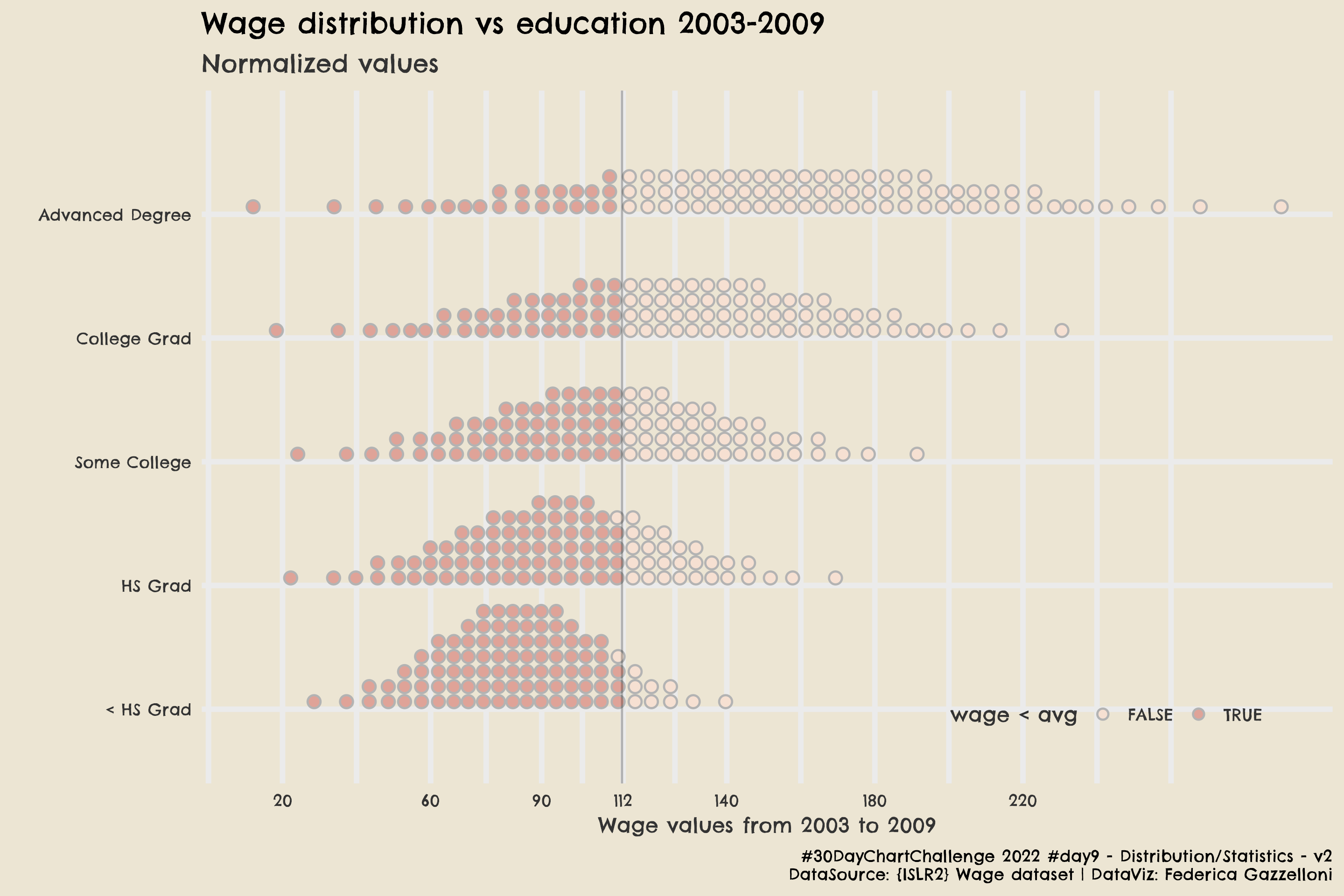
This is one of my favourite visualizations. It looks like very simple, and straight forward with the use of the ggdist::stat_dots function to make dotted ditributions of the wages by highest educational status reached.

The Tidyverse libraries needed for the data manipulation:
The data set is the Wage dataset from the {ISLR2} package. This package contains a variety of datasets used for statistical analysis in An Introduction to Statistical Learning book.
Data Wrangling
A bit of data wrangling to group by education and calculate the mean value and the standard deviation of the wage.
Set some extrafonts:
For this visualization I used: family = “Chelsea Market”
And finally, to make the plot, use:
- ggdist::stat_dots to make the dots ditribution
- distributional::dist_normal to normalize the data
Wage1 %>%
ggplot(aes(y=fct_reorder(education,mean),
             xdist = dist_normal(mean, sd),
             layout = "weave",
             fill = stat(x < 111.70))) +
  stat_dots(position = "dodge", color = "grey70")+
  geom_vline(xintercept = 111.70, alpha = 0.25) +
  scale_x_continuous(breaks = c(20,60,90,112,140,180,220)) +
  tvthemes::scale_fill_hilda()+
  # add a title / subtitle and a caption ------
  labs(x="Wage values from 2003 to 2009",
       y="",color="Race",fill="wage < avg",
       title="Wage distribution vs education 2003-2009",
       subtitle="Normalized values",
       caption="#30DayChartChallenge 2022 #day9 - Distribution/Statistics - v2\nDataSource: {ISLR2} Wage dataset | DataViz: Federica Gazzelloni") +
  # set a customized theme -------
  tvthemes::theme_avatar() +
  theme(text = element_text(family="Chelsea Market"),
        legend.background = element_blank(),
        legend.box.background = element_blank(),
        legend.key = element_blank(),
        legend.key.width = unit(0.5,units="cm"),
        legend.direction = "horizontal",
        legend.position = c(0.8,0.1))
If you’d like to save it as .png you can do it with ggsave()
ggsave("day9_statistics_v2.png",
       dpi=320,
       width = 9,
       height = 6)